
TreadingScreen Explanation
TreadingScreen Explanation

What is this?
The TreadingScreen is a weekly list of tickers that meet a set of criteria based on a particular technical analysis (TA) setup. The list of tickers is automatically generated from a program created in coding language “R”. The program analyzes the price action of all stocks currently listed on either the NASDAQ or NYSE. In total, more than 8,000 stocks are analyzed on a weekly basis. As a general note, all micro/small cap companies are currently eliminated from consideration.
The program outputs the list of tickers along with the criteria used in selection as well as a corresponding price chart (example below). The objective is to present this shortlist of tickers with advantageous setups and document its performance relative to the general market (e.g., - $SPY). The method of performance tracking is explained in greater detail in the next section.
Figure 1: Example chart output from custom stock screening program

In addition to the full TreadingScreen, there is also a manual analysis process that attempts to refine the tickers for improved performance. This process involves:
Manual selection of the best TA setups
Eliminate tickers with upcoming earnings dates (typically a lotto play)
Additional DD/FA (company news, financials, macro effects, etc.)
After considering 1-3 above, the companies who remain make up the TreadingSelect as a subset of the TreadingScreen.
Figure 2: The differences between TreadingScreen and TreadingSelect

The objective of the TreadingScreen is to outperform the general market and, assuming the manual selection process is beneficial, TreadingSelect should have the best performance overall.

Performance Assessment
The TreadingScreen is generated on the weekend for performance tracking during the upcoming week. Each ticker is tracked individually and is most easily understood by first explaining the Open-High-Low-Close (OHLC) charting symbol:
Figure 3: OHLC symbol explanation

If we consider the OHLC bars above as representing a 1-week time interval, the OPEN and CLOSE prices occur at 9:30am Monday and 4:00pm Friday, respectively. The HIGH and LOW prices could occur at any time in-between the Open and Close but this timing is not critical for this assessment.
For example, the detailed price action of Johnson & Johnson ($JNJ) for CW23 is shown below as a line chart (thin blue line). The corresponding weekly OHLC symbol is overlayed showing the critical price levels explained above.
Figure 4: Example showing where the OHLC price levels originate on a detailed line chart.

For each ticker in the TreadingScreen, these four price levels are used to calculate three hypothetical return percentages assuming the stock is purchased at the OPEN price and sold at the weekly…
…CLOSE price
…HIGH price
…LOW price
Figure 5: Percent return calculations based on selling condition (i.e., - CLOSE, HIGH, LOW price)
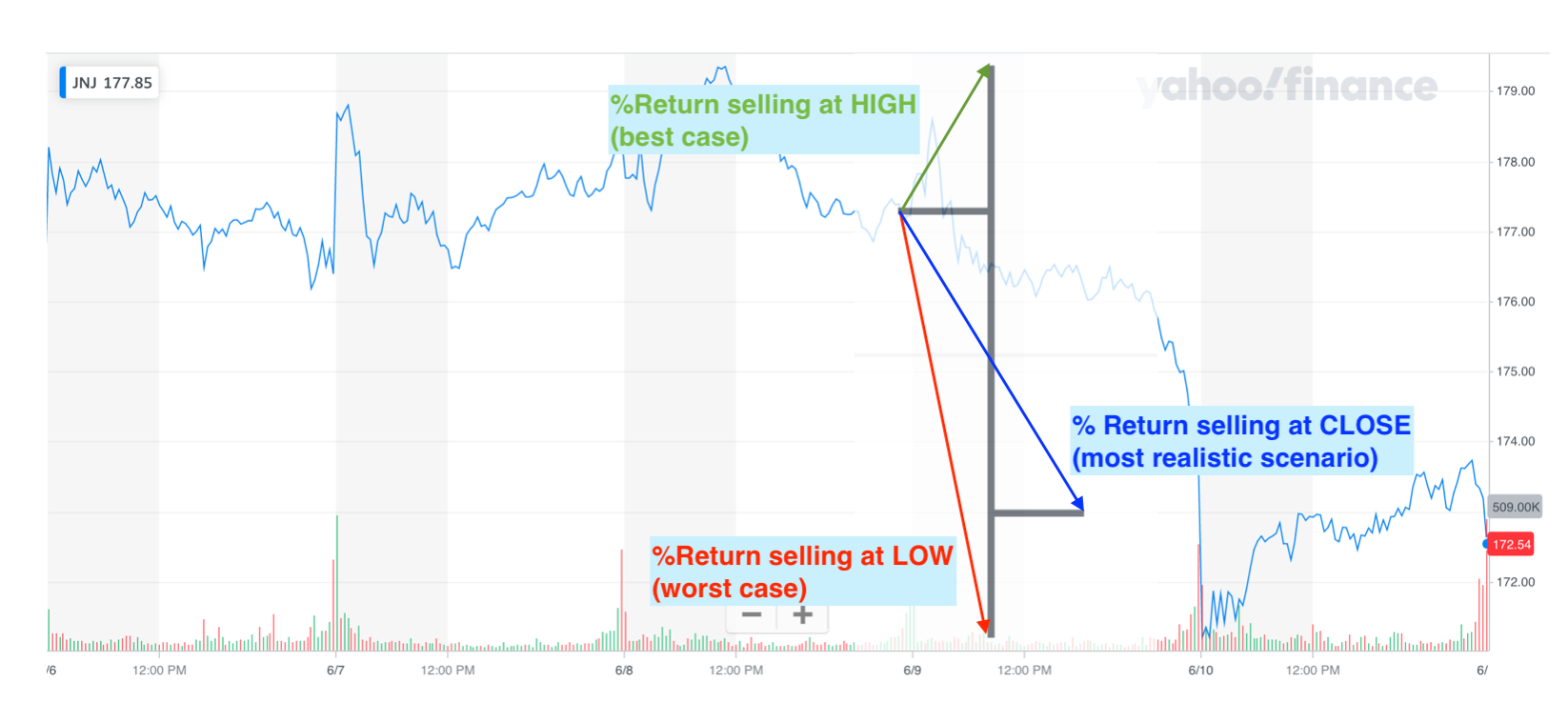
Selling at any of the exact prices above is nearly impossible, but the same analysis can easily be repeated with $SPY for comparative purposes. The CLOSE-sell scenario is the most relevant as it provides a realistic measure of the 1-week price direction.
Each ticker in the weekly TreadingScreen generates three data points based on the sell-scenarios described above. After combining this data across all tickers, a distribution of performance returns can be plotted.
Figure 6: Percent return distribution “cloud” for each sell-scenario in CW22 (14 tickers).

For illustrative purposes only, a particular ticker’s triad of data (i.e., - CLOSE, HIGH, & LOW returns) can be visualized as shown below. The only obvious requirement is that the CLOSE return falls between the LOW and HIGH returns.
Figure 7: Hypothetical assignment of a ticker’s return data triad (CLOSE, HIGH, & LOW returns)

The distribution “clouds” above can be represented via the more traditional boxplot method. A boxplot is able to convey the distribution, skewness, and outliers of numerical datasets. The distribution “clouds” are included in Figure 8 for comparison to the generated boxplots.
Figure 8: Boxplots efficiently representing the distribution of returns data.

The bold black line contained within the “box” of each boxplot above is the TreadingScreen’s median return. Below, the TreadingScreen mean return (large orange dot) and $SPY’s return (large blue diamond) are added to the summary plot.
Figure 9: Final performance summary plot with TreadingScreen means and $SPY returns added.

How to Interpret
The goal of the TreadingScreen is to outperform the general market (e.g., - $SPY). A good result would be if the median and/or mean returns are higher than $SPY’s. As can be seen above, CW22’s TreadingScreen experienced higher returns regardless of selling assumption.
Lastly, the TreadingSelect is intended to be a higher-performing subset of the TreadingScreen; a final visual of this concept is provided below.
Figure 10: TreadingSelect’s goal is to identify a higher performing subset of tickers.

Since this subset is usually only a few tickers, a separate distribution plot is not necessary. Rather, the means or individual values will be used for comparison to $SPY.